Category Archives: direct mail

Feeling blue.

coco-connolly_bluePromo_friendandjohnson1

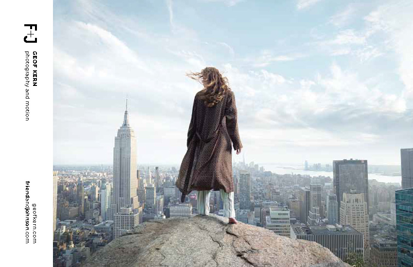
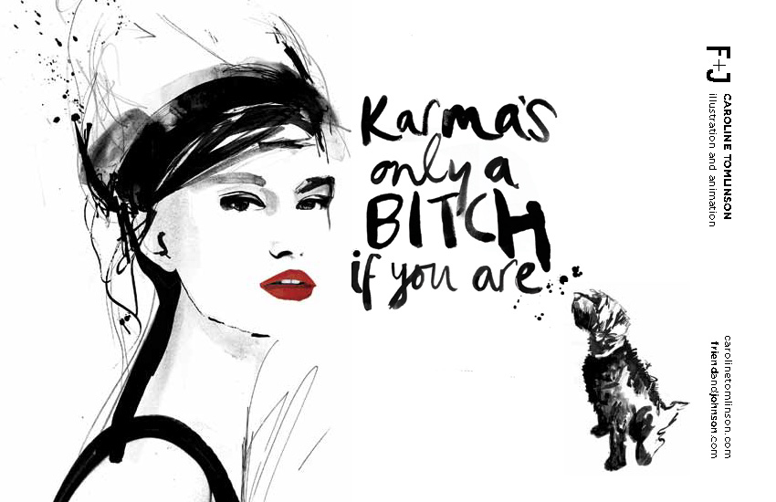
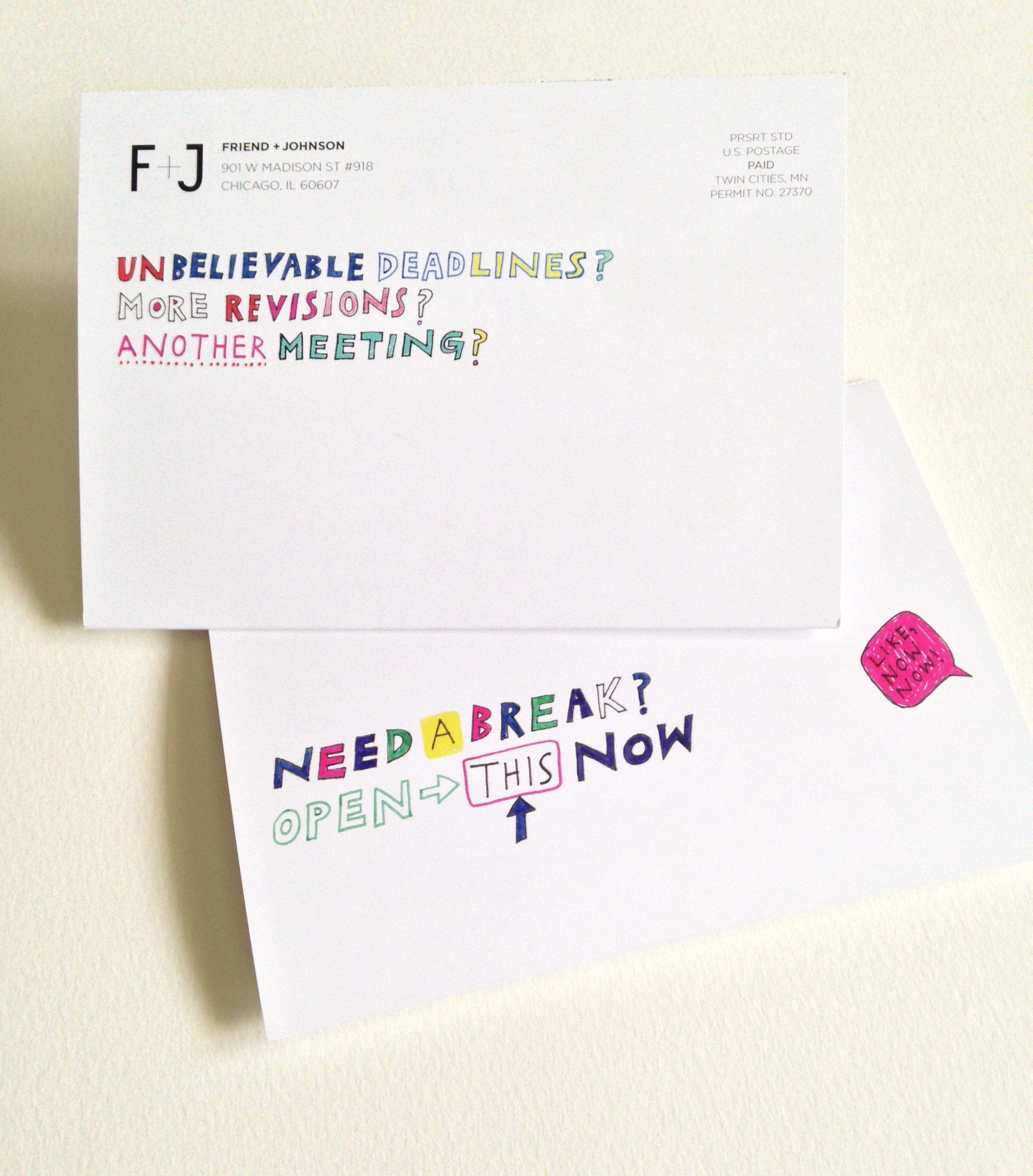
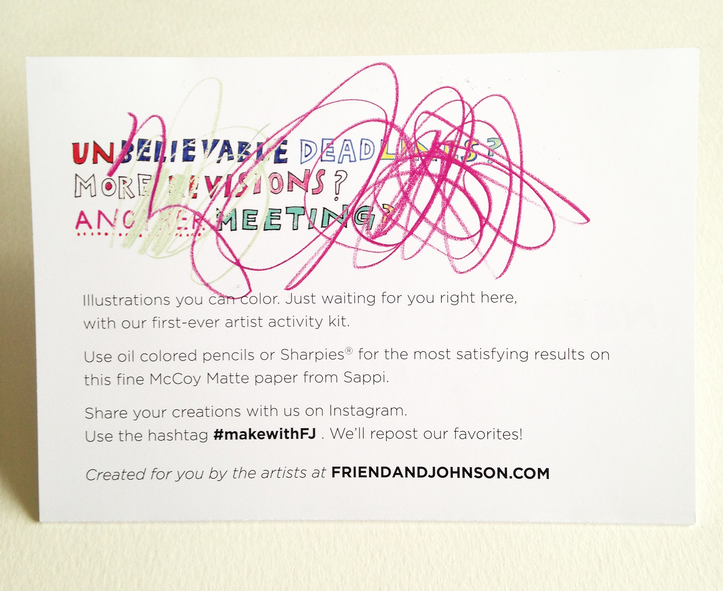
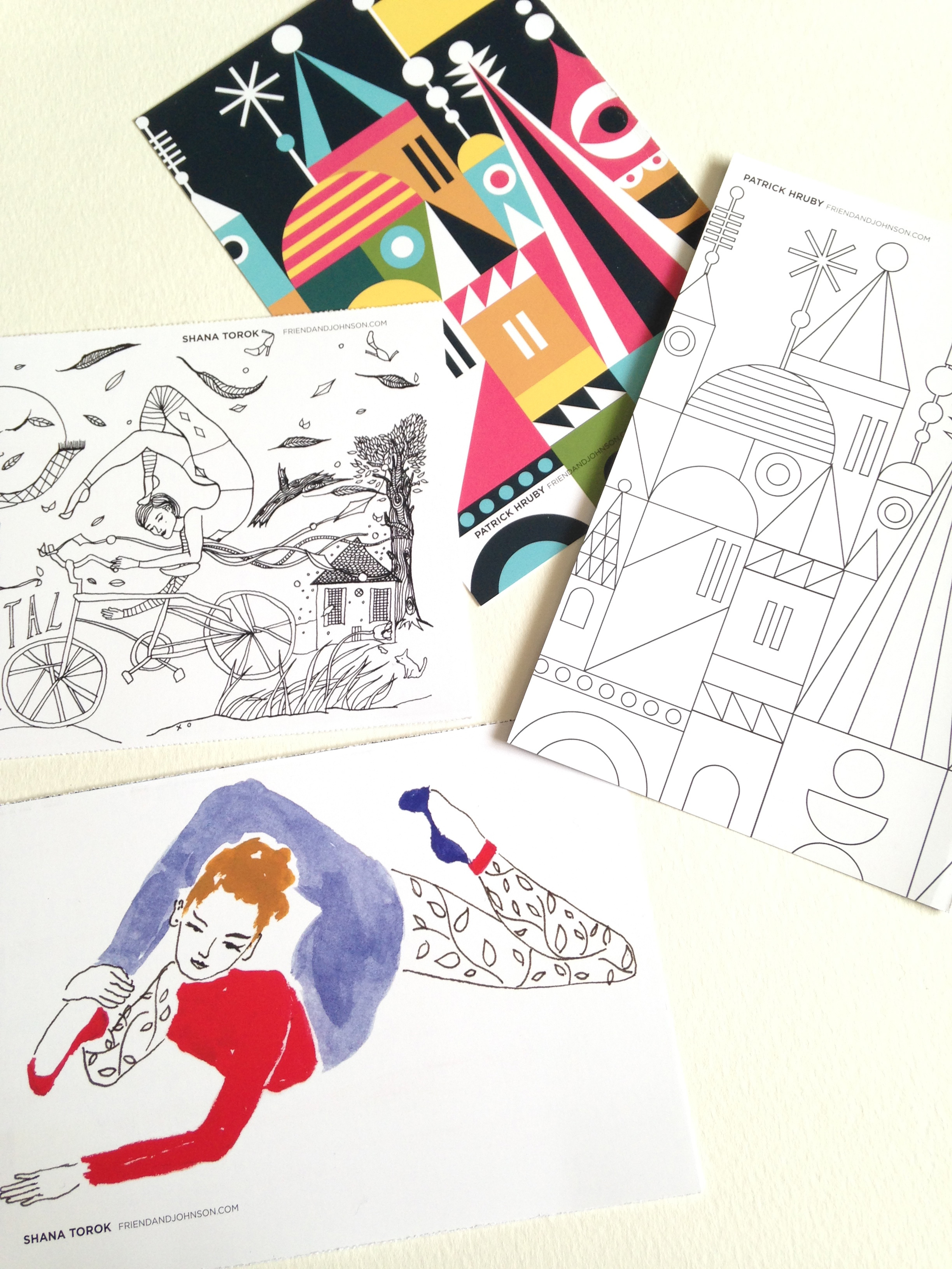
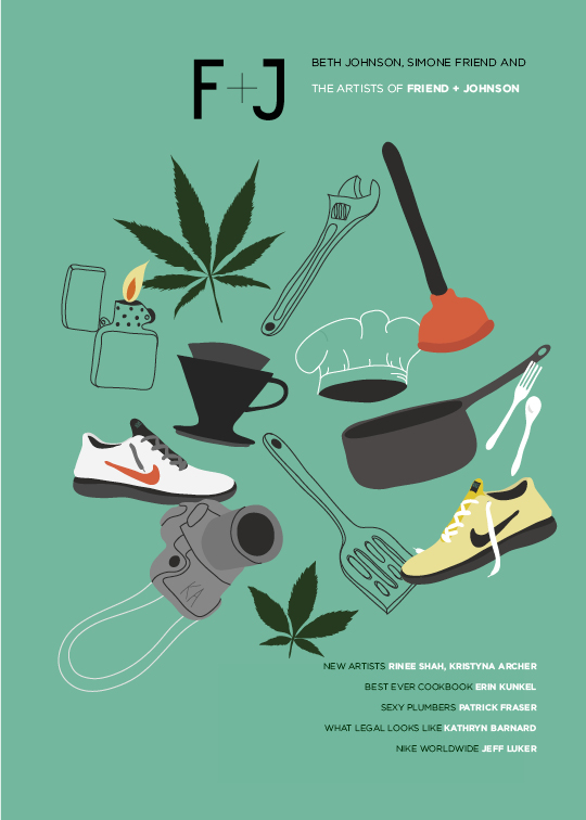
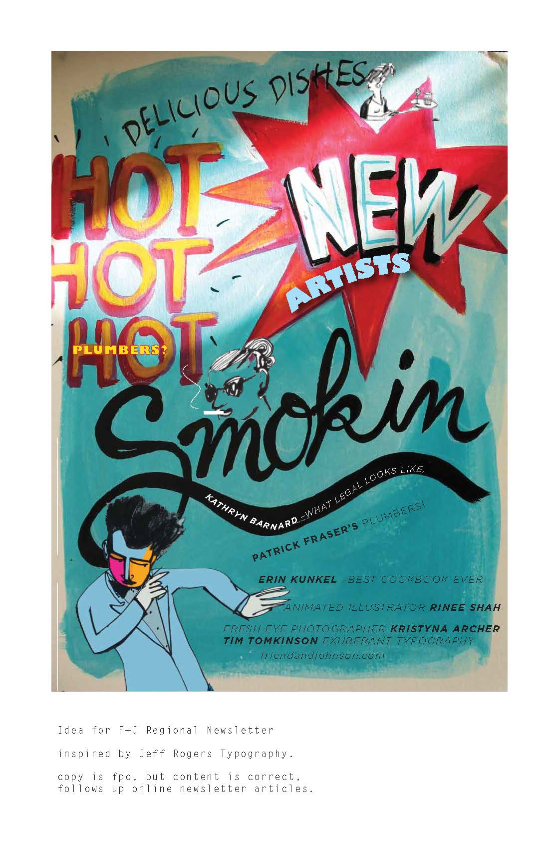
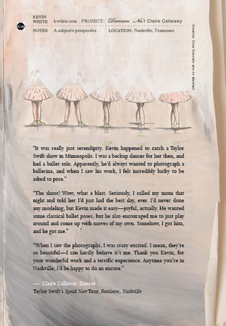
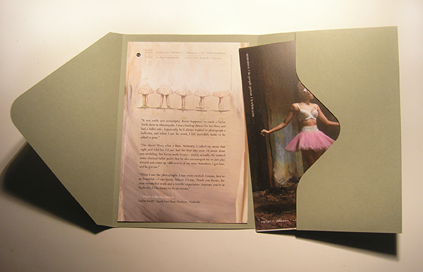
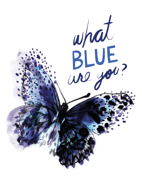
Mailing this week. New promo for the illustrators of Friend and Johnson. Type by Rinee Shah. Butterfly by Caroline Tomlinson.

VIEWING BLUE MAY SLOW YOUR HEART RATE. BUT WHAT BLUE? SO MANY BLUES.
caroline tomlinson, new artist at Friend and Johnson coco-connolly_jill-calder_f+jPromo coco-connolly_rinee-shah_f+jPromo coco-connolly_sean-mosher-smith_f+jPromo coco-connolly_tim-tomkinson_f+jPromo

I gathered some random blue thoughts to run along side the illustrations. I liked the idea that blue could possibly calm the heart rate. I could use some of that this week…I’ll say no more! You know what I’m talking about.

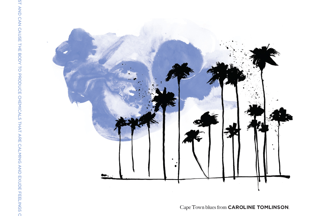
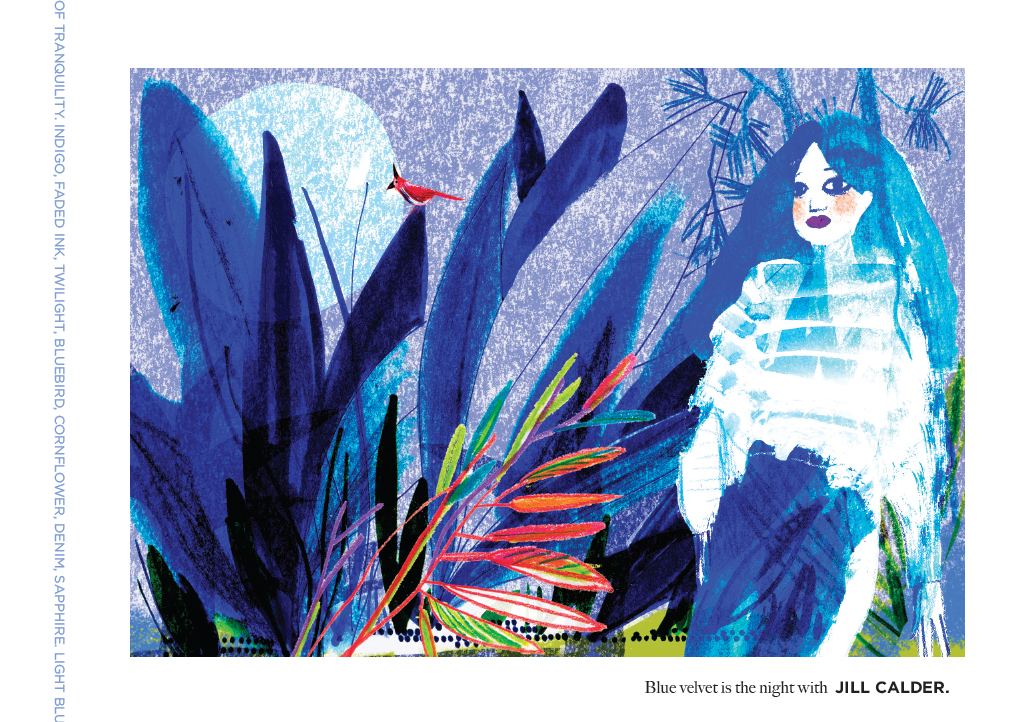
BLUE IS A COLOR THAT SUGGESTS PEACE. AS THE COLOR OF THE SPIRIT, IT INVOKES REST AND CAN CAUSE THE BODY TO PRODUCE CHEMICALS THAT ARE CALMING AND EXUDE FEELINGS OF TRANQUILITY. INDIGO, FADED INK, TWILIGHT, BLUEBIRD, CORNFLOWER, DENIM, SAPPHIRE. LIGHT BLUE IS THE COLOR MOST LINKED TO CREATIVITY. SKY BLUE IS THE MOST CALMING SHADE OF BLUE.

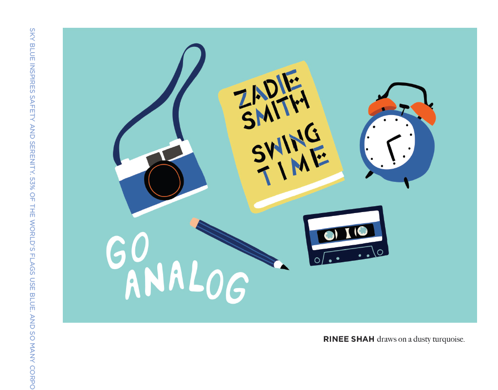
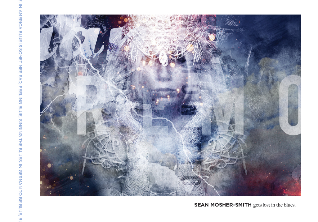
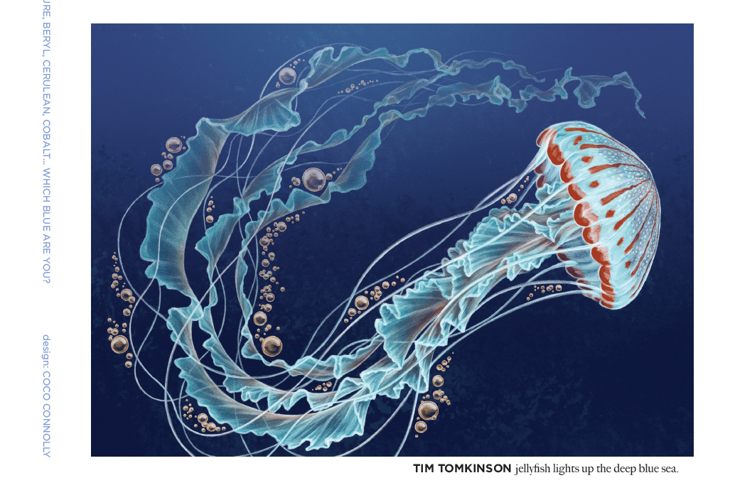
SKY BLUE INSPIRES SAFETY AND SERENITY. 53% OF THE WORLD’S FLAGS USE BLUE. AND SO MANY CORPORATE LOGOS. DARK BLUE REPRESENTS KNOWLEDGE, POWER, INTEGRITY, AND SERIOUSNESS. THE BUSINESS POWER SUIT, BLUE UNIFORMS OF POLICE. GREEKS USE BLUE TO WARD OFF THE EVIL EYE. IN AMERICA BLUE IS SOMETIMES SAD, FEELING BLUE, SINGING THE BLUES. IN GERMAN TO BE BLUE, BLAU SEIN, IS TO BE DRUNK. BLUE IS A FAVORITE COLOR OF PEOPLE ALL AROUND THE WORLD. AZURE, BERYL, CERULEAN, COBALT… WHICH BLUE ARE YOU?                 

design: COCO CONNOLLY

Now showing in Graphis Design Annual 2018

St Jude_coco-connolly_invite2016_1

St Jude_coco-connolly_2016-invite

Creative Director Jen Sheeler from FAME does it again. Another lovely invite for the worthy cause of St. Jude Children’s Research Hospital. Here’s what the agency had to say about the project for their recognition in GRAPHIS 2018 :
It can be tough to convince the black-tie crowd to get spiffy again right after the holidays. Apparently many of them suffer from ‘event fatigue’ so it’s critical to convince them that your event is worthy. So when Fame client St. Jude Children’s Research Hospital partnered with the Golden Globes for a private screening gala in multiple markets, Fame romanced the fun of getting gussied up and going out to see the stars claim their hard-won prizes. (All to benefit the kids and families of St. Jude.) Original fashion-sketch-style illustrations were donated by a local artist, and the vibrant red truly broke through in both traditional and digital channels.

“Local artist” would be moi. : )

Red Carpet illustrations for St. Jude event invite.

              Mailing now! Thank you to Jen Sheeler, Creative Director at FAME for including me in this worthy cause. Fundraiser for St. Jude Children’s  Research Hospital I painted the originals in watercolor on 140# hot press Arches paper.

coco connolly_stJude_twoWomen Experimented on scan with curves in photoshop. Interesting, but client was looking for the more traditional look of fashion illustration.CocoConnolly_stJude_adjustedCurves

“I dreamed I danced in my Maidenform bra.”

KevinWhite_dancerPromo_coco5The first thing that came to mind when Kevin White showed me his photos of Claire Callaway was the Maidenform campaign from the 1950’s. Such an outrageous, yet sticky campaign!

No, I refrained from using the photos to spoof that campaign. Opted instead to package the new work in a mini portfolio envelope, found on Marsupial Papers, showcasing four portraits of Claire. Writer Jo Marshall interviewed Claire about the shoot. I included Claire’s thoughts about working with Kevin, placing the text on an illustration I created.

KevinWhite_dancerPromo_coco

OLYMPUS DIGITAL CAMERA